Package design is the most challenging form of advertising. It lacks the storyline of a commercial, the vastness of a billboard, the dynamics of an online ad. The package is forced to deliver its message non-verbally with static content on minimal space while sharing the spotlight with every competitor in the category. From a marketing perspective, this isn’t an ideal situation, especially if you consider the fact that the package offers a unique chance to speak directly to consumers at the very moment that they make their purchase decision. It’s a golden opportunity, and yet a cluttered environment and mediocre medium make it difficult to take advantage. The struggle to STAND OUT on the shelf is the primary reason that eye tracking research on CPG has flourished in recent years. Retailers realize that understanding visibility is the key to gauging the effectiveness of a given package design.
There are two approaches to testing packages using eye tracking technology, both of which EyeTracking, Inc. has practiced extensively over the past decade. From study design through data analysis, these approaches are quite different. Before beginning a project, we believe that it’s important for clients to appreciate the benefits and drawbacks of each one.
Testing Digital Images of Packages
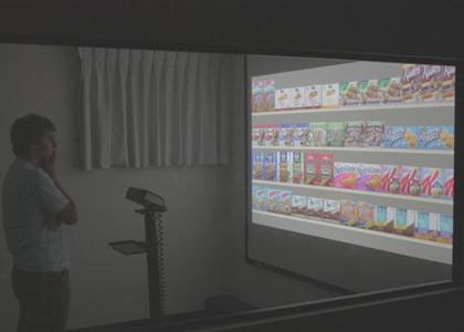
The Process: The first step is to generate electronic images of your target materials. This includes the product/s that you will be testing along with any alternate versions and competitors to be included on your virtual shelf sets. Once the images have been finalized, a script is created (often automated) to guide participants through the interaction. A high-definition projector is used to show all images, instructions and questions within the script, and an eye tracker (remote or glasses) is used to collect data during each session.
The Benefits: If you’re looking for flexibility and depth of analysis, this is the best approach for you. The automated nature of presentation allows you to easily randomize shelf placements, present prototypes that have not yet been produced and ensure that every participant views the exact same packages from the exact same vantage point. To put it simply, you are in control of your research – which package versions are shown, where they are shown and for how long. Because of this control, the data are more conducive to thorough analysis, including accurate assessments of (a) time until the target package is seen, (b)percentage of attention devoted to the package, (c) number of repeat looks at the package, (d) attention to specific package elements, (e) total time on shelf and many others. Additionally, the quality of graphic and video outputs is better when using this approach.
The Drawbacks: The problem with not testing real packages is that you’re not testing real packages. As convincing as your projected images may be, they cannot be picked up, flipped around and scrutinized as they might be in the store. Because of this limitation, it becomes especially important that other components of your research are as realistic as possible, for example the quality of images, projection, instructions and sample tested. When these study details are managed successfully, testing projected images is an extremely valuable approach that can provide a real competitive advantage.
Testing Actual Packages on a Shelf
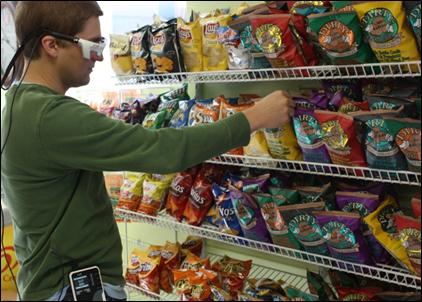
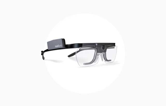
The Process: With this approach, you may either test in an actual store or in a package testing lab with a realistic shelf of products. Instructions to participants are typically given verbally, and they may include prompts that allow the participant to physically interact with the package/s. A mobile eye tracker (typically glasses or headset) is used to collect data during each session. In some cases, a set of IR markers is used to define the calibrated space and targeted packages (recommended).
The Benefits: The main benefit of this approach is realism. You are testing actual products on an actual shelf, maybe even in an actual store. Participants are free to walk back and forth down the aisle. They may pick up a package to see how heavy it is or look at the side panel to find nutritional information. It isn’t hard to see how this is a big advantage. No matter what discipline of research you’re talking about, the most realistic testing scenarios usually produce the most generalizable results.
The Drawbacks: The cost of realistic data collection is labor-intensive analysis. When testing actual packages, you don’t have a single static shelf image to analyze; you have thousands of frames of video that change as each participant moves. In order to generate precise visibility results, the targeted packages need to be accounted for in each of those frames, which can be time consuming and expensive. Alternatively, this approach can be used as a qualitative method. Skip the detailed analysis, and instead use the eye data as a directional tool. Your results may not be statistically conclusive, but you’ll be getting a rare opportunity to see exactly what your customer sees in a real shopping environment. Depending on the purpose of your study, that may be every bit as informative as a fine-grained assessment of specific visual behaviors.
So which approach is the best approach? As far as we’re concerned, when executed properly they’re both enormously useful in evaluating CPG effectiveness. Your research objectives will dictate which approach is most suitable for your study.
Featured image from Unsplash.

